728x90
반응형
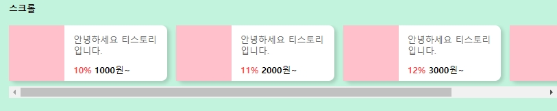
html 에서 ul li가 여러번 반복되는데 너무 길어질것 같아서 li는 한번만 보이게 밑에 부분은 지웠어요~
<div id="new_item_wrap">
<div class="section_title">
  <h2>스크롤</h2>
</div>
<div class="new_item_box">
  <ul class="new_item_list">
    <li class="new_item">
      <a href="#">
        <span class="new_item_img"></span>
        <dl class="new_item_text">
          <dt class="new_item_name">안녕하세요 티스토리입니다.</dt>
          <dd class="new_item_info"><p class="new_item_per">10%</p><b class="new_item_price">1000</b>원~</dd>
        </dl>
      </a>
    </li>
  </ul>
</div>
</div><!--#new_item_wrap-->
#new_item_wrap{position:relative; margin-top:-1.563em; width:800px; height:200px; padding:2.25em 0 4.153em 1em; border-radius:1.56em 1.56em 0 0;  box-shadow:-2px -3px 5px 1px rgba(0,0,0,0.15); background:#c2f3dc; }
.new_item_box{margin-top:1.438em; box-sizing:border-box; width: 100%; overflow: hidden; overflow-x: scroll;
display: flex; -webkit-overflow-scrolling: touch;}

.new_item_box .new_item_list{position: relative;  display: flex; padding-bottom:0.625em;}
.new_item_box .new_item_list:after{content:""; clear:both; display:block;}

.new_item_box .new_item_list .new_item{margin-right:1em; width:17.75em; height:6.25em; border-radius:0.65em; background:#fff; box-shadow:3px 3px 5px 1px rgba(0,0,0,0.15);}
.new_item_box .new_item_list .new_item a{display:block; width:100%; height:100%;}
.new_item_box .new_item_list .new_item a:after{content:""; clear:both; display:block;}

.new_item_box .new_item_list .new_item .new_item_img{position:relative; float:left; display:inline-block; text-align:center; vertical-align:middle; width:6.25em; height:100%; background:pink;}
.new_item_box .new_item_list .new_item .new_item_img img{position:absolute; left:50%; top:50%; transform:translate(-50%,-50%); display:none; max-width:100%; max-height:100%; border-radius:0.5em; }

.new_item_box .new_item_list .new_item .new_item_text{position:relative; float:left;  padding:1em 0 0 1em; box-sizing:border-box;
word-wrap:break-word; display:-webkit-box; text-overflow:ellipsis; overflow:hidden; -webkit-line-clamp:2; -webkit-box-orient:vertical;}
.new_item_box .new_item_list .new_item .new_item_text .new_item_name{width:9.375em; font-size:1em; color:#666; line-height:1.3;}
.new_item_box .new_item_list .new_item .new_item_text .new_item_info{margin-top:0.785em; font-size:1em; color:#000; line-height:1;}
.new_item_box .new_item_list .new_item .new_item_text .new_item_info > p{display:inline-block; margin-right:0.31em; color:#ff4a4a; font-weight:bold; }
제일 중요한 css
타이틀 밑에있는 div의 x축 스크롤이 생기게 하기위해서 width값을 설정하고
overflow-x :scroll 을 주게되면 설정한 width값이 넘어가면 스크롤이 생성됩니다.
(반응형으로 만드느라 em단위를 썼는데 단위는 상관없어요)
728x90
반응형
'IT > html + css' 카테고리의 다른 글
| [gnb] gnb menu (1) | 2020.05.06 |
|---|---|
| [animation] 간단한 애니메이션 효과 (1) | 2020.04.30 |
| [CSS] display:tabel 을 이용한 연혁표 만들기 (0) | 2020.01.19 |
| [css] display:table-cell;을 이용한 갤러리 만들기 (0) | 2020.01.18 |
| [css] display:table-cell 을 이용한 원형에 배경넣기 (0) | 2020.01.17 |


댓글